

It may seem like a counterintuitive approach at first, but incorporating friction into your user experience can have a wide array of benefits.
First things first, however, what is user friction? In essence, it is anything that stops a user from accomplishing their end goal. It’s a barrier preventing them from getting something done. For example, an optional question before the final checkout stage or a newsletter signup form that sits over website content.
With ease of use and seamless functionality being so sought after characteristics seeing just how friction can improve UX can be difficult at first. But the benefits it can have are wide-reaching so let’s have a look at the ways that you can use friction to improve UX.
Table of Contents
The Benefits of Using Friction in UX Design
Initially, a lot of it comes down to a simple question, just how do you define user experience? Once you have done this you’ll see that friction can be a good thing as the right amount of friction can facilitate user interactions instead of just getting in the way of them.
Adding friction to your platform can help reduce user errors as well as help users achieve their goals in a comfortable and reassuring manner.
Confirmation emails before finalising a purchase, verification steps when handling personal information and pop-up overlays that look for certainty before a permanent deletion are all considered a form of positive friction UX that have been designed to make the process longer yet still beneficial.
This UX cognitive friction can be crucial when it comes to building trust and confidence, especially in regards to new users who may be unfamiliar with your company or processes.
Friction That Helps Retention
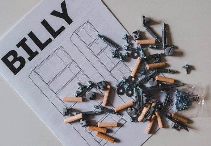
IKEA is a retailer internationally known for selling furniture products that require self-assembly. You buy the collective parts to a table, desk or cupboard, receive instructions on how to assemble it correctly and then perform the task yourself at home.
This approach means IKEA can keep their prices low, but studies also show that people value self-built products very strongly leading to a phenomenon referred to as: the IKEA effect.
The friction of having to assemble your own furniture before using it increases its perceived value to the person. Simply put, the more effort you put into something, the more you will come to value it.
However, this effect is only achieved if the user was able to finish the task successfully, they won’t value that IKEA cupboard if it was impossible to put together and remains unfinished.
As well as this, the reward following the completion should always feel greater when compared to the amount of effort required to finish it. Not even the best IKEA marketing campaigns ever will be able to make up for this.
However, if this sweet spot between effort and value can be achieved, retention of customers becomes much more likely down the line.
What Happens Without Friction?
Without some level of friction being built into your user experience, it can lead to some severe consequences. Not only will your users potentially see less value in your site and company, but it can lead to errors that otherwise could have been prevented.
One-click checkout and sign out functionalities that don’t require a confirmation stage can lead to erroneous and unwanted purchases that can cause users to form mistrust in your business.
As an example, within Gmail, if you have written an email that includes the phrase ‘I have attached’ or something which is similarly worded but have forgotten to include said attachment, it will notify you.
The fully seamless approach would see this email sent immediately as you hit send, however, due to this in-built friction the user is able to realise their error and rectify it before it becomes an embarrassing problem.
In the case of extremely frictionless shopping, the likelihood of making an incorrect or unwanted order will rise, something which is likely to ruin a user’s overall experience. In contrast, a typical e-commerce checkout process features at least one explicit confirmation to be completed before an order can be placed.
With handheld devices such as mobiles or tablets, it might even be a particular gesture or a fingerprint approval to stop any accidental purchases. All of this in-built friction lets the user feel in control of the process and makes them more comfortable about parting with their money or security details.
5 Ways Friction in Design Can Be Essential For UX
So with all this in mind, let’s take a closer look at just some of the ways in which well-designed friction can lead to positive user experiences:
- Prevents Bad Decisions – Introducing frictions into a product or service creates an important moment for the user to stop and think about what they are doing. This moment greatly reduces the risk of mistakes and misclicks because of the effort necessary to overcome the friction. When people are required to stop and analyse the situation it gives them time to reflect. Something as simple as a system dialogue to confirm a delete action can be the difference between someone staying subscribed to your product updates or not.
- Prevents Accidental Transactions – Security measures might feel like friction to users but the majority of people like that they are in place. Many applications require a second factor of authentication before logging in or making a significant transaction, especially when large amounts of money or private information is being transferred. While this may be an extra step that makes the overall process longer, this added effort displays a further layer of protection on their account and data. All of which adds to a greater level of user trust when interacting with your products.
- It Can Help You Sell – Friction is often used effectively to help improve conversions and generate a greater number of leads. Examples of this include push notifications that promote a variety of upgrade options or a newsletter signup popup that appears during the reading of an article or blog post. However, make sure that you don’t go overboard with the amount of promotional friction you put in front of someone because it can quickly become a frustrating distraction for them.
- Teaches Responsibility – Friction can also add an ethical element to your UX. A user decision can have negative consequences, especially if it has the potential to affect other users. In such cases, a confirmation ensures an action is intentional, but also that it’s being used in a responsible manner. The messaging platform Slack features a warning that appears before sending out push notifications to a group. This not only makes the user aware of the direct consequences this elected action can have but also educates them in how to use this option respectfully in the future.
- Makes Long Processes Feel Shorter – The inclusion of a progress indicator or bar during loading times is a common feature. Displaying content piece by piece over a continuous period of time produces a sense that everything is happening smoothly, quickly and efficiently. These indicators can be designed to let users know what is happening and, more importantly, that everything is under control.
How Selective Friction Makes a Big Difference When It Comes To UX
Friction can get a bad reputation, but it’s not inherently a negative concept. Like any design tool, friction should be used in a proper context. Properly used, friction can be a very powerful tool for designing better experiences.
However inappropriate friction will have negative effects in regards to your UX. If there are unnecessary steps in a process, unclear navigations or too much information on the screen at once, it can lead to frustration amongst your users.
Being selective about the type of friction you incorporate can make all the difference to your users. So whether it’s about giving someone a moment of reflection before a large action, taking the right amount of time to explain the situation thoroughly or just prompting users towards promotional offers, don’t be afraid to leverage friction if the situation warrants it. It can make the overall user experience a whole lot more enjoyable.
Write For Mazzine™
We hope you have enjoyed these 5 Simple Ways Friction in Design Can Be A Game-Changer For UX.
Interested in writing for Mazzine™? We would love to hear from you! – Join our community of writers from around the world. – Check out the guidelines on the Write for us. page.